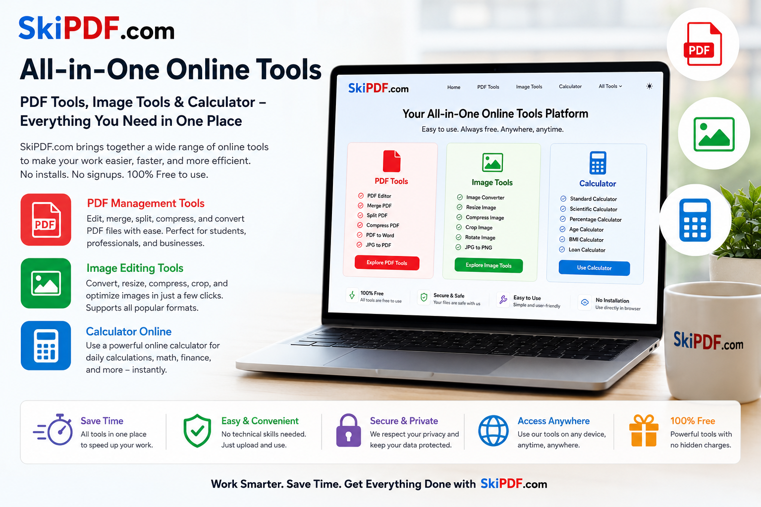

- Building a multi-functional online tools platform isn’t about cramming widgets onto a single page. It’s about choreographing a seamless experience where a PDF editor, an image converter, and a calculator online feel like natural extensions of a user’s thought process. Most tool sites bolt features together haphazardly, forcing visitors to relearn interactions with every click. When you design the whole thing well, however, something magical happens: the interface fades into the background, and users get things done without ever thinking about the technology underneath. Let’s pull back the curtain on what it takes to craft a cohesive digital workshop that genuinely saves time, reduces friction, and feels like it was designed just for you.
The Core Principle: Unified Mental Model, Zero Context Switching
- The biggest design challenge in a multi-tool platform is cognitive load. Users arrive with a goal—“make this PDF smaller”—and often discover they need secondary actions, like converting an image to insert or calculating dimensions. A well-designed site anticipates these chains and keeps every tool within a consistent, predictable framework. Instead of siloed sections that look and behave differently, every tool shares the same design language: the same drag-and-drop zones, the same button hierarchy, the same feedback messages. When you move from compressing a document in the PDF editor to resizing a photo in the image converter, nothing jars. The canvas changes, but the environment feels familiar. This continuity is the bedrock of usability.
Designing the PDF Editor for Clarity, Not Clutter
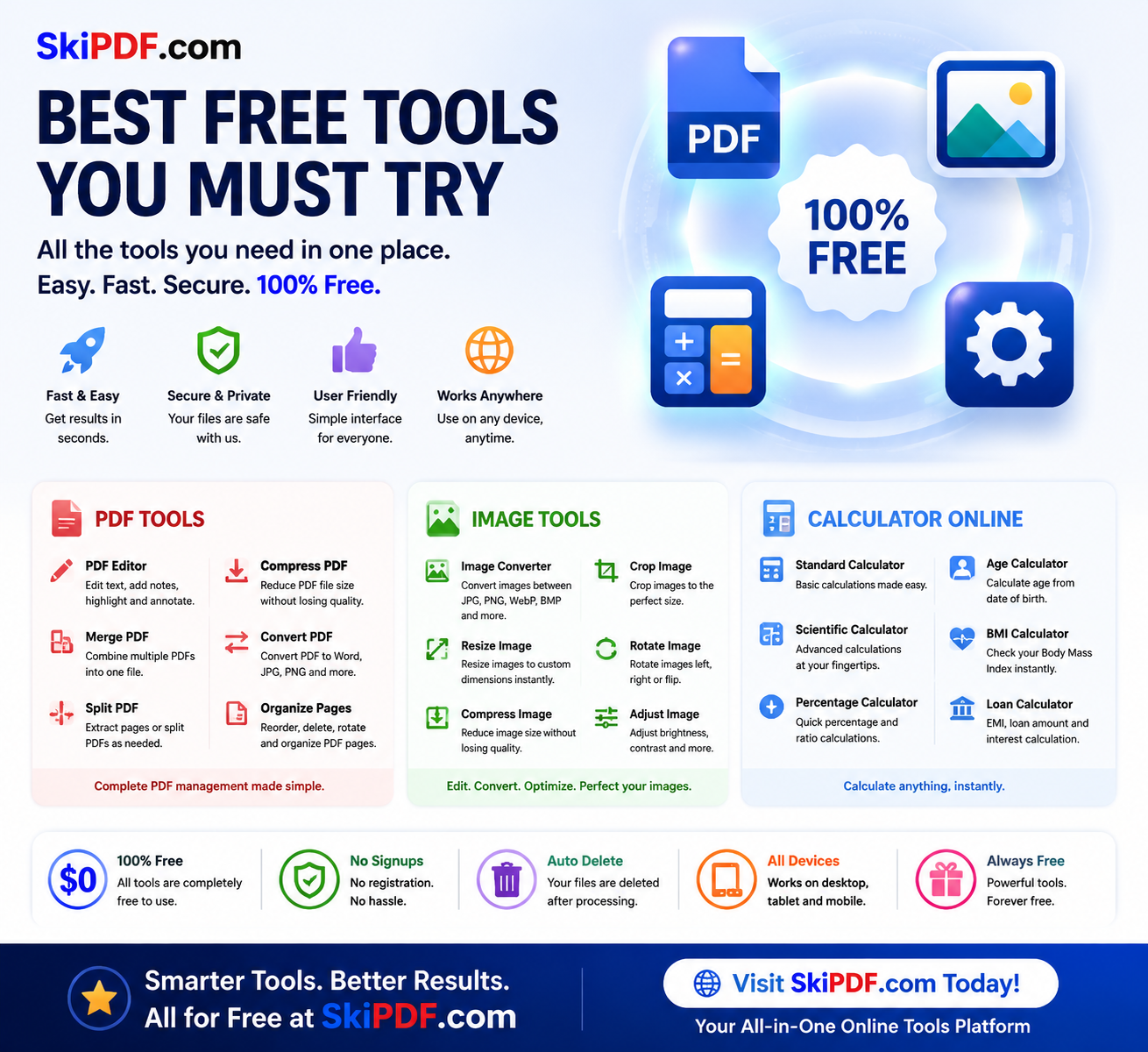
PDF management is notoriously feature-heavy, which tempts designers to frontload every option on one screen. That’s a mistake. Great design hides complexity until it’s needed. A clean initial interface might show only a large drop zone and a few primary actions: Merge, Split, Compress, Convert, Edit. Each action then reveals contextual controls. For example, selecting “Edit PDF” slides open an annotation toolbar with text, draw, and signature tools placed exactly where the eye expects them (top or left). The signature tool itself is a mini-design challenge—how do you make signing feel natural? A smooth freehand canvas with clear undo/redo and the option to type or upload an image strikes the right balance.
Real-world use case: a freelancer editing a contract needs to add a text clause and sign. The design must allow layer-appropriate interactions—text boxes that don’t float unpredictably, signature placement that snaps to a line—so the user completes the task in under a minute without a manual. All processing should happen visually, with live previews, so there are no surprises on download. Privacy is a design feature too: client-side processing indicated by subtle “processing locally” badges reassures users their files never leave their device.
Crafting an Image Converter That Feels Effortless
- Image editing inside a browser often suffers from two extremes: overly simplistic tools that can’t handle real-world needs, or feature-bloated interfaces that mimic desktop software without touch-optimized controls. A well-designed image converter uses progressive disclosure. The initial screen accepts files and offers one-click format switching (PNG to JPEG, WebP to PDF, etc.), but a collapsible “advanced options” panel holds resolution, quality sliders, and resizing. The resize function itself is a UX gem: instead of requiring manual pixel entries, it can offer preset dimension buttons for common platforms (Instagram square, LinkedIn banner, A4 print), with the ability to lock aspect ratio by default.
Consider a small business owner preparing product photos for an online store. They need to compress multiple images, convert them to JPEG, and resize to 1200×1200 pixels. The design must support batch operations—drag in a folder, see a clean table of thumbnails, apply settings to all, and hit “Process.” Visual feedback like a progress ring and a preview toggle helps users trust the outcome. Because this tool lives alongside the PDF suite, the download button might include an option to “package as PDF contact sheet”—a subtle bridge that only a unified platform can offer, turning separate tasks into a continuous flow.
The Calculator Online: Embedded, Not Bolted On
A calculator online on the same platform shouldn’t feel like a pop-up from a different website. The best design weaves it into the workspace as a slide-out panel or a persistent sidebar that remains accessible regardless of which tool you’re using. Why? Because users often need to crunch numbers while editing a document or resizing an image. If the calculator opens in a modal that blocks the file preview, it breaks the workflow. Instead, imagine a collapsible right-hand panel with a tabbed calculator—basic, scientific, and unit converter. It maintains its state as you switch between tabs, so you can resize a photo to half its pixel dimensions, calculate that exact number in the same panel, and type it directly into the width field.
The calculator UI should be spacious, with large tap targets for mobile users, and support both mouse clicks and keyboard input seamlessly. Memory functions and a history tape add genuine utility without cluttering the core interface. The design win is context: the calculator knows it’s a companion, not the main event, so it stays quiet until summoned and tucks away without losing your place.
The Game-Changer: How Design Weaves File, Image, and Calculation Tools Together
Individually, each tool solves a problem. But the integration is where design truly becomes a game-changer. The most profound moment for a user happens when they realize they didn’t have to leave the tab. Picture this: a student annotating lecture slides (PDF editor) needs to add a diagram they just snapped with their phone. They upload the image, use the image converter to rotate and crop it, resize it to fit the slide’s placeholder, and then embed it directly into the PDF. While doing so, they calculate the remaining space for text using the built-in calculator. On a conventional setup, that would be three different websites and one external app. The unified design collapses that journey into a single, fluid dance.
From a design perspective, this requires a shared file system in the UI—a temporary “workspace” where files processed by one tool are immediately available to another. A “quick actions” menu that suggests next steps (“Compressed PDF? Now merge it” or “Image resized? Convert to PDF”) guides users through multi-step projects without a linear wizard that feels restrictive. The visual cues—consistent iconography, unified color coding for actions (green for download, blue for process, gray for reset), and micro-interactions that confirm success—build a rhythm of productivity. Users stop seeing the tools and start seeing their work getting done.
Usability and Time-Saving Design on Every Device
A platform hosting online tools must perform flawlessly on phones, tablets, and desktops. Responsive design here doesn’t mean simply stacking elements; it means rethinking how interactions work with a thumb versus a mouse. The PDF editor on mobile might show a simplified toolbar that expands to full edit mode when the device is in landscape. The image converter automatically defers heavy processing to web workers so the UI never freezes. The calculator is always reachable from a floating action button in the corner of the screen. Every second shaved by thoughtful touch targets, pre-filled defaults, and instant previews adds up to a time-saving experience that respects the user’s intent, not just their clicks.
Conclusion: When Design Disappears, Productivity Soars
The best multi-functional tool website isn’t the one with the longest feature list. It’s the one where the PDF editor, image converter, and calculator online blend so naturally that users can’t pinpoint why it feels so easy—they just know they got everything done in five minutes flat. That’s the outcome of intentional, empathetic design: consistency in visual language, smart tool integration, contextual assistance, and relentless removal of unnecessary steps. When you design the whole thing well, you’re not just providing utilities; you’re crafting a digital workbench that elevates how people solve everyday problems, making complexity simple and fragmentation whole
skipdf.com